


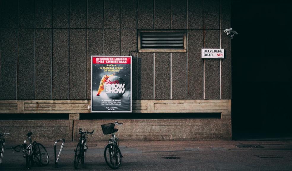
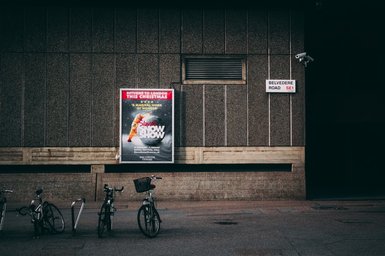
Simple banner design changes that could make a difference
Designing banners for advertising could be overwhelming. You have tons of ideas, and you end up throwing them all on the banner. As a result, the final design becomes too tacky and unappealing. You do not want to use the banners for advertising since you could turn off many people. Try taking a step back and edit the design if possible. These simple design changes could do wonders.
Remove one or two colours
Determine the number of colours used on the banner. Try to minimise the colours if possible and do not go beyond three, except if necessary. There is nothing wrong with a splash of colour, but avoid it being overwhelming. Some people might not respond well to such a design. It also decreases the professional appeal of the banner.
Crop the image
You might use an interesting image that you believe would be appealing to people. However, when you see the final design, you do not get that feeling. It seems like something is missing in the photo or there is too much going on. Try cropping the photo to eliminate other elements and highlight only the primary subjects. You will then realise that the final design looks much better than when first conceived.
Reduce the text
You want to explain a lot to your audience to convince them to buy your products. The problem is that banners do not offer a lot of space for you to explain everything. You need to be concise when describing your thoughts. It is why some banners do not have any text at all. The images and symbols do the talking. Go through the text again and determine what you can cut out - but still deliver the same message.
Drop the latest promotion
If you want people to stop and see what is on the pull up banner, the best option is to display information regarding a promotion. The products will suddenly become enticing to the target audience if they read something about how they could save money by buying the products. Even if they have already seen other options, they might change their mind because of the promotion.
Try to come up with ways for the banner to be appealing. Remove or add elements that you think will make the design less overwhelming. You only have a few moments to captivate the people who see it. You also need to compete with other banners placed in the same area. You want to stand out and create an impact. When you put several unnecessary elements, you might not have the same intended result.
Ask the people in your office to comment on the final designs. They might prefer the simpler versions if you try to take out some unnecessary elements. Sometimes, when you are in a room with other people in your marketing team, you end up with tons of ideas, and some of them do not help boost the appeal of the banner design, and you may not be aware of it.

 accreditation for the county")